Visualizing Palestine aims to transform complex information and data into compelling stories. These stories are distributed to targeted audiences. The goal is to change the global view of the Palestinian cause. These factual stories can increase the pressure on the world leaders. The stories shed light on the root causes of injustice in Palestine. The visualized data supports the Palestinian people efforts for justice.
Transforming Data into Visuals
Visualizing Palestine monitors and collects research and data around the organization’s narrative goals. They use a process wheel in their approach to data storytelling. This process shows the steps taken from research, story conceptualization, design, and outreach.
The crew of Visualizing Palestine begins by collecting data on an agreed upon subject. Then photographers and architects use this factual data and strong evidence. They use data, maps, videos, blogs, and photos. Visualizing Palestine produces visual stories. These stories offer a new perspective on the reality of what is happening in Palestine. The transformation of narrative data into visual information or “infographics” exposes the violations of the occupation.
The “infographic” designs present a better understanding of living under occupation. The information corrects misconceptions particularly in the Western world. The information makes people aware of the Israeli occupation policies. The materials show how these polices impact Palestinian civilians in the occupied territory.
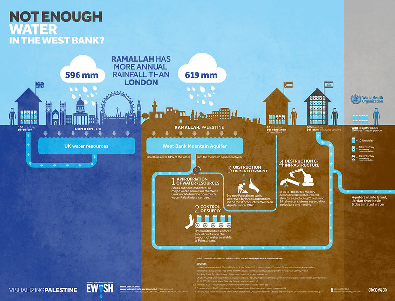
 Photo showing one of the visualizations of “Visualizing Palestine” (PS).
Purpose of Visual Data
The purpose is to shed light on the root causes of human rights violations committed by occupation troops. These violations impact on the daily lives and struggle of Palestinians. Visualizing Palestine documents data into the form of a simple show. For example, it begins with the birth of Palestinian babies on the borders. Then reveals a complex visual exposing discrimination in sharing water in the occupied West Bank. This shows a different perspective of the occupation. It includes the forced displacement of Palestinians. The loss of their homes and lands as a result of the occupation. It provides a visual timeline focusing on the demographic changes of the region.
For more resources from New Tactics on data visualization, please see:
The Use of Data Visualization in Human Rights Advocacy
Visualizing Information for Advocacy
Visuals can be an effective way to share complex information. Visuals can serve many functions. Such as educating both targeted and large groups of people. Visuals can help break stigmas and expose human rights violations. When working with data, it is important to represent the facts. Consider the variety of ways these facts can illustrated. Consider your context. Remember that people learn and take in information in different ways. Blogs and stories may be effective with one audience. Videos and photos may be a better option for others. Keep in mind your target audience. They may have physical, visual or hearing impairments. Consider how to make adjusts for how the data can be best shared. Special care may be necessary when working online. For example, especially in areas operating where media censorship is high. Anonymity may also be vital when using personal stories in your data collection and sharing. When dealing with already marginalized groups, it is important that sources are not revealed to ensure their protection from further harm or potential backlash.
New Tactics in Human Rights does not advocate for or endorse specific tactics, policies or issues.